Overview
79% of Shopify store traffic comes from phones. Yet the average mobile conversion rate for Shopify stores is 1.2%, while desktop conversion rates stand at 1.9%. That gap means most Shopify merchants are losing their biggest revenue opportunity to avoidable mobile friction. This guide walks you through 10 proven, mobile-specific CRO tactics to close that gap, covering everything from page speed to express checkout to touch-friendly product pages.
Contents
The mobile conversion gap: why it matters
Mobile shopping trends are constantly going up; Shopify stores experience significant variations in conversion rates across desktop, mobile, and tablet devices. Typically, desktop conversion rates are higher than mobile, although mobile traffic accounts for a larger share of total visitors. The average mobile conversion rate (1.2%) remains significantly below desktop (3.1%). Closing even half of this conversion gap would increase total store revenue by approximately 40% from the same traffic.
Checkout friction, smaller screens, and sometimes less trust are the main reasons mobile falls behind. The good news: the best stores are closing the gap with one-page checkouts, accelerated payment methods, and mobile-first design. Each tactic below targets a specific piece of mobile friction you can fix.
Step 1 - Optimize mobile page speed
Speed is the single highest-impact fix for most underperforming mobile stores. Google's research shows that 53% of mobile users abandon a page that takes more than 3 seconds to load. Shopify stores that load in under 2 seconds convert 2-3x better than stores that take 5+ seconds. Every additional second of load time drops conversion by 7-12%.
Based on Shopify data, research, and experiments, even a half-second improvement in site speed can increase conversion rate. Here is how to get those gains:
Compress and convert images to WebP format. Shopify automatically compresses images on upload, serves them at appropriate sizes through its theme infrastructure, and delivers modern file formats like WebP to supported browsers. That said, you can still gain speed by optimizing images before upload. Resize photos to no larger than the maximum display size your theme uses, and run them through a tool like TinyPNG or Squoosh before uploading. Avoid uploading raw camera files or oversized PNGs when a compressed JPEG or WebP will do. The goal is to minimize the work Shopify has to do and ensure the source files are as lean as possible from the start.
Audit and remove unused apps. Apps can slow down Shopify stores, but the impact varies. Well-built apps that load asynchronously add minimal overhead. Poorly built apps that inject render-blocking JavaScript can add 1-3+ seconds.
Defer non-critical JavaScript. Mobile devices have less processing power, slower network connections, and smaller caches than desktops. A page that loads in 2 seconds on desktop Wi-Fi might take 6+ seconds on a phone with 4G. Mobile browsers also execute JavaScript more slowly.
Target Core Web Vitals thresholds. LCP (Largest Contentful Paint) measures main content load speed; target under 2.5 seconds. CLS (Cumulative Layout Shift) measures visual stability; target under 0.1. INP (Interaction to Next Paint) measures responsiveness; target under 200ms.
Tip - Use Shopify's built-in Online Store Speed report as your starting point, then drill into Google PageSpeed Insights for detailed mobile diagnostics.
What if my mobile PageSpeed score is below 50?
A good PageSpeed Insights score for Shopify is 60-80 on mobile and 80-95 on desktop. Achieving above 80 on mobile is considered excellent for a feature-rich ecommerce store. Scores below 50 on mobile indicate significant performance issues that are likely impacting both conversion rates and search rankings. Start with image compression and an app audit; most stores can cut mobile load time by 40-60% with those two fixes alone.
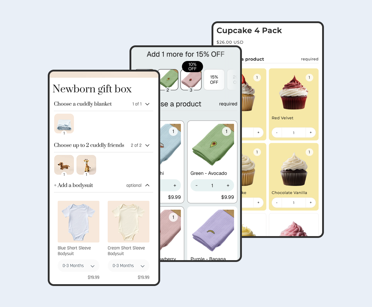
Step 2 - Add a sticky add-to-cart bar
For mobile users, a sticky Add to Cart bar is not a convenience; it is essentially required for optimal conversion. Without it, mobile users who scroll deep must perform a counter-intuitive upward scroll to access the purchase CTA. The sticky bar removes this friction entirely.
A sticky add-to-cart bar typically lifts conversions 8-15% on mobile. Keep the bar simple: product thumbnail, price, variant selector, and a prominent Add to Cart button. The sticky bar can appear at the top or bottom of the screen. Both work, but each has different ergonomic implications. For most Shopify stores where mobile represents 60%+ of traffic, bottom placement is the better default.
Step 3 - Enable express checkout and digital wallets
Shop Pay provides an average 9% lift in conversion for all checkouts including mobile, and an 18% higher conversion rate for returning customers. An external study by a Big Three consulting firm found Shop Pay lifts conversion by up to 50% versus guest checkout, and outperforms all other accelerated options by at least 10%.
Offering express checkout options (Apple Pay, Google Pay) adds another 3-5% lift for mobile users. The single fastest mobile conversion rate improvement for most Shopify stores is enabling Shop Pay + Apple Pay + Google Pay if they are not already active.
Go to Settings > Payments in your Shopify admin.
Enable Shop Pay, Apple Pay, and Google Pay under your payment provider settings.
Verify that express checkout buttons appear on product pages and in the cart, not just at the final checkout step.
Step 4 - Design for thumbs, not cursors
Mobile phones are held with one hand and operated with a thumb for the vast majority of interaction. The natural comfortable reach zone for a thumb on a modern smartphone covers the bottom two-thirds of the screen. CTAs, navigation elements, and key interactive elements should be placed in this zone where possible.
Thumb-friendly CTA buttons (min 48x48px) increase mobile tap accuracy by 30%. Make sure your "Add to Cart" and "Buy Now" buttons are large, high-contrast, and surrounded by enough padding that users do not accidentally tap nearby elements.
Tip - Test your product pages by holding your phone in one hand. If you cannot comfortably reach the CTA or navigate variant selectors with your thumb alone, your buttons need to move.
Step 5 - Simplify mobile navigation
Use a clean, simple "hamburger" menu. Don't overload it. Prioritize search and the most critical categories. On mobile, every unnecessary menu item adds cognitive load and slows the path to purchase.
Expose a prominent search icon in your mobile header. Many mobile shoppers arrive knowing what they want; making search accessible with one tap removes the need to browse through category trees. Consider predictive search results that display product images and prices directly in the dropdown.
Step 6 - Streamline mobile checkout forms
Address autocomplete reduces the number of keystrokes required for address entry by 50-70% and virtually eliminates address entry errors. On mobile, where typing is already tedious, address autocomplete is transformative for checkout completion rates.
24% of shoppers abandon when forced to create accounts. Complex checkout causes 18% abandonment, while the average checkout contains 11.3 form fields versus an ideal 8 fields. Enable guest checkout, reduce form fields to essentials only, and make sure input types match the data expected (numeric keyboard for phone and zip code, email keyboard for email).
The good news: Shopify's checkout is already designed with these principles in mind. It handles address autocomplete, guest checkout, and smart input types out of the box. Your focus should be on avoiding customizations that undo these built-in optimizations rather than rebuilding from scratch.
What if I am using Shopify's default checkout?
Shopify's default checkout flows all content into a streamlined, minimal-step experience. Avoid any customizations that add additional pages or steps to the checkout process. On mobile, each additional screen represents a navigation action and an additional opportunity for abandonment. The default Shopify checkout flow is already well-optimized. Your main improvement levers are enabling express payment options and ensuring address auto-fill works properly.
Step 7 - Show trust signals early and often
19% abandon carts due to trust concerns with payment. On mobile, where the brand experience feels less established on a small screen, trust signals become even more critical.
Stores with 50+ reviews see 15% higher conversion rates. Display star ratings near the product title, add payment security badges close to the Add to Cart button, and show a clear return policy snippet on the product page. Displaying trusted security badges generates a 32% increase in conversion rates on checkout pages.
Step 8 - Display shipping costs and policies upfront
The average Shopify cart abandonment rate is approximately 70%, in line with the global ecommerce average. Mobile abandonment runs higher at 75-78%, with unexpected costs at checkout being the top cause.
Stores that display free shipping thresholds prominently on product pages see 8-12% higher conversion than stores that hide shipping costs until checkout. Use a free shipping progress bar in your cart drawer and mention your shipping policy on every product page. Free shipping reduces cart abandonment by 18%. 58% of shoppers add items to qualify for free shipping.
Step 9 - Optimize mobile popups and interstitials
Poorly timed popups are one of the fastest ways to tank your mobile conversion rate. Google penalizes intrusive interstitials on mobile, and users find full-screen popups that appear immediately to be disruptive. Configure exit-intent popups offering first-time visitor discounts (10-15%) or free shipping thresholds. Time these offers to appear after 30+ seconds of engagement to avoid immediate interruption.
Use small slide-in banners or bottom-sheet style popups instead of full-screen overlays on mobile. Keep the close button large and easy to tap. If you must collect emails on mobile, limit the form to a single email field.
Step 10 - Add buy-now-pay-later options
Businesses offering mobile wallets see up to 30% higher conversion rates. Buy-now-pay-later options generate 35% conversion increases for higher-ticket items. On mobile, where cart abandonment is already elevated, installment options can be the nudge that converts hesitant shoppers.
For Shopify merchants, BNPL integrates directly into your checkout flow through apps in the Shopify App Store. Customers see installment options alongside standard payment methods, making the experience seamless. Shop Pay Installments, Klarna, and Afterpay are the most common options. Display the per-installment price on product pages (e.g., "4 payments of $12.50") to reduce sticker shock before shoppers even reach checkout.
FAQ
What is a good mobile conversion rate for a Shopify store?
Benchmark studies find mobile around 1.5-2% while desktop is around 3.5-4%. If your mobile conversion rate is below 1.2%, your mobile experience has specific problems worth investigating. A mobile CVR above 3% is strong, and above 4% is excellent.
Which single tactic will have the biggest impact?
For most stores, page speed and express checkout deliver the largest measurable lifts. Page speed is the foundation. Shopify stores that load in under 2 seconds convert 2-3x better than stores that take 5+ seconds. Every additional second of load time drops conversion by 7-12%. This is the single highest-ROI fix for most underperforming stores.
How do I measure mobile conversion rate separately from desktop?
In your Shopify admin, go to Analytics > Reports and filter by device type. You can also use Google Analytics 4 to create segments by device category. Always segment your conversion rate by device before drawing conclusions. A store with 80% mobile traffic and a 1.6% overall conversion rate might actually be performing excellently. A store with 50% desktop traffic and the same 1.6% rate is underperforming.
Does mobile page speed affect SEO rankings?
Yes. Google switched to mobile-first indexing in 2021. This means Google primarily crawls, indexes, and ranks your site based on its mobile version. Your desktop speed score is essentially irrelevant to rankings. If your desktop score is 90 but your mobile score is 25, Google sees you as a 25.
Should I build a separate mobile app for my store?
For most Shopify merchants, optimizing the mobile web experience first delivers better ROI than building a native app. However, the average mobile website converts at 2%, while shopping apps hit 3.5%. If you have a loyal customer base with high repeat purchase rates, a dedicated app may be worth the investment. Focus on the 10 tactics in this guide first, then evaluate an app once your mobile web experience is fully optimized.
 View on app store