Overview
Choosing a theme sets your ceiling for user experience, performance, and SEO. The right theme gives you controls that prevent layout shift, keep navigation simple on phones, and expose the SEO settings you need. This guide walks you through the exact settings to look for so you can test a theme demo with confidence before you buy or switch.
You will learn how to verify image aspect ratio settings, mobile show and hide toggles, lazy loading options, sticky header behavior, desktop and mobile navigation flexibility, single H1 control, and hreflang support. Each section includes a quick test you can run in the theme editor or demo preview.
Content
- Prerequisites - Confirm niche fit and support
- How to test a theme demo safely
- Step 1 - Check Sections Everywhere and App Blocks (OS 2.0)
- Step 2 - Confirm image aspect ratios
- Step 3 - Confirm lazy loading options
- Step 4 - Confirm sticky header settings
- Step 5 - Check desktop and mobile navigation
- Step 6 - Verify single H1 control
- Step 7 - Validate mega menu and collections within nav
- Step 8 - Product media capabilities
- Step 9 - Cart UX pattern (drawer vs page)
- Step 10 - Translations, RTL, and currency
- Step 11 - Accessibility quick audit (WCAG 2.1 AA)
- Step 12 - Performance budgets and motion
- Performance and accessibility checks
- Buying checklist and red flags
- FAQ
Prerequisites - Confirm niche fit and support
Start by ensuring the theme fits your niche and that the theme developer provide timely updates and support. This reduces rework and avoids getting stuck on bugs.
- Open the theme’s listing and check the last updated date, changelog, and compatibility with the current Shopify version.
- Scan support docs and look for a clear contact method. Aim for vendors that document known issues and resolutions.
- Compare the demo to your catalog: number of collections, image styles, and merchandising needs.
How to test a theme demo safely
You can evaluate many of these features in a theme demo before purchasing it.
On the Shopify theme store, you can install any theme free of trial in trial mode. This lets you access all features of the theme except for inspecting it's code.
You can effectively entirely set up your theme before you pay for it and go live.
The goal is to see whether the controls exist and behave predictably without editing code.
- Use the theme demo preview to open common templates like home, collection, and product pages.
- Look for section settings that match the checklist in this guide. Take screenshots as you go.
- Avoid judging by animations alone. Prioritize clarity, spacing, and reading comfort.
- Keep a short list of must haves and nice to haves so decisions stay practical.
Step 1 - Check Sections Everywhere and App Blocks (OS 2.0)
All themes in the Shopify Theme Store are Online Store 2.0 compatible. OS 2.0 lets you use sections across templates and insert app blocks without code, giving you layout flexibility while keeping performance predictable.
If you evaluate a third-party theme outside the Theme Store, confirm it is OS 2.0.
- Open a non homepage template (e.g. collections, pages) and confirm sections can be added, removed, and reordered.
- Add an app block (if you use apps) and check that it renders without shifting content after load.
- Remove the app block and verify the layout remains stable and fast.
Step 2 - Confirm image aspect ratios
Aspect ratio controls keep product grids consistent and prevent layout shift while images load. Themes that let you set a square or portrait ratio make your catalog look deliberate and help maintain fast pages.
- Open Online Store, then Themes, then Customize. Go to a collection template.
- Select the product grid section. Look for a setting like Image ratio, Crop image, or Card ratio.
- Switch between Square, Portrait, Landscape, and an Adapt / Auto / Natural setting. Confirm the grid stays aligned without content jumping.
- Inspect a product image element and check that it uses responsive attributes like srcset and sizes.
Why aspect ratios matter
Reserving space for media reduces cumulative layout shift, a key metric tied to perceived quality. Shopify guidance on images and media emphasizes using appropriate sizes and responsive loading to keep pages stable and sharp.
- Use a consistent ratio for grid items to avoid rows with uneven heights.
- Set a defined aspect ratio in sections whenever the theme supports it.
- Upload right sized source images so the theme can render crisp assets without bloat.
Step 3 - Confirm lazy loading options
Lazy loading defers images and videos until they are near the viewport. This reduces initial network cost and speeds up first render. Themes often provide a checkbox or implement lazy loading automatically for below the fold media.
- Open a long homepage or collection template with multiple media sections.
- Scroll slowly and watch the Network tab. Below the fold media should load only as you approach.
- Ensure the hero image and primary content are not lazy loaded, as that can slow your largest contentful paint.
- If available, enable a Lazy load setting on sections and confirm it applies only to non critical media.
Side note - Shopify provides guidance on lazy loading for partners and theme developers. Even if your theme does not expose a toggle, it may already lazy load images using modern attributes under the hood.
Step 4 - Confirm sticky header settings
Sticky headers keep navigation and search within reach. They are especially helpful on mobile where scrolling is frequent. Poorly configured sticky headers can overlap content or trap focus incorrectly, so test this behavior.
- In the Header settings, toggle Sticky header on. If available, set separate options for desktop and mobile.
- Scroll a long page. Ensure the header does not cover content during anchor jumps and that the close icon remains visible when a drawer is open.
- Open the mobile menu drawer. The background page should not scroll and keyboard focus should remain inside the drawer until you close it.
- Confirm tap targets for icons and links are comfortably sized, ideally 40px or larger.
Tip - If the header frequently covers content, use a smaller sticky variant on mobile or disable sticky on small screens where necessary.
Step 5 - Check desktop and mobile navigation
Navigation should be flexible enough for your catalog size and audience. Look for clear alignment controls, mega menu support, and a mobile drawer that is easy to use with one thumb.
- Open the Header and Navigation sections. Look for options to set the primary menu, alignment, and logo position.
- Check for multi column or mega menu options if your catalog is large. Keep nesting shallow on mobile.
- Verify the search placement is obvious. Search should be reachable in one tap from the header.
- Preview on a small screen and confirm links are spaced so you can tap without mis clicks.
Tip - Put shopping links first, such as Shop, Collections, Best sellers, and Sale. Move About and Blog lower in the menu.
Step 6 - Verify single H1 control
Search engines and assistive technology rely on a clear heading hierarchy. Each template should have exactly one H1. Themes that let you choose heading levels in sections make it easier to avoid duplicates.
- Open a product, collection, and page template in the editor. Identify which element renders as the H1.
- Check sections and blocks for a Heading level setting. Change decorative headings to H2 or H3 while keeping the same visual class.
- Use your browser inspector to verify there is only one H1 on each page type and that other headings cascade correctly.
Side note - Shopify theme requirements emphasize valid HTML, semantic headings, and accessibility. Correct heading levels help both users and crawlers understand page structure.
Watch out - Shopify's rich text editors in the theme editor let you set content to a h1, which makes it easy to accidentally add multiple h1's on a page.
Step 7 - Validate mega menu and collections within nav
Large catalogs need clear multi column menus and visual groupings. Your mega menu should scale down gracefully on phones.
- Enable a mega menu or multi column menu in header settings. Add example link groups and, if supported, small images.
- Open on a phone sized viewport and verify columns collapse into a readable drawer without overwhelming the screen.
- Confirm that collection links are discoverable within two taps and that scrolling does not reset the menu state.
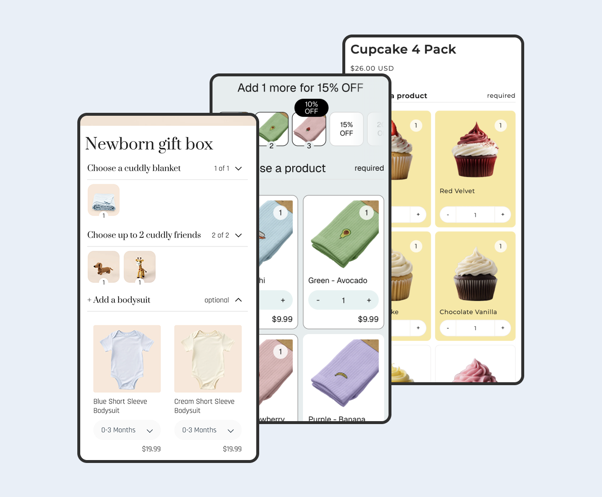
Step 8 - Product media capabilities
Better product media drives confidence. Verify the theme supports the media types and gallery patterns you need.
- Add image, video, and 3D model examples to a product. Confirm zoom or lightbox behavior and gallery thumbnail layout.
- Switch variants and ensure the correct media displays for each option. Map color swatches to images when available.
- Check that media loads responsively and does not cause layout shifts.
Step 9 - Cart UX pattern (drawer vs page)
The cart is where many customers decide to continue or leave. Test how the theme’s cart pattern behaves and what it supports.
- Enable the cart drawer if available. Add a product and open the cart. Ensure keyboard focus is trapped inside and the background does not scroll.
- Verify any built in upsell/cross sell blocks, free shipping progress bars, and discount inputs work and are clear.
- Try both drawer and dedicated cart page modes to see which fits your store and app stack best.
Step 10 - Translations, RTL, and currency
International storefronts require good translations, right to left support where relevant, and accurate currency formatting via Markets.
- Enable an additional language and preview strings across core templates. Confirm text expansion does not break layouts.
- If you serve RTL languages, verify layout mirroring, icon direction, and drawer/menu alignment.
- Switch countries in Markets and confirm price formats, currency codes, and separators render correctly.
Step 11 - Accessibility quick audit (WCAG 2.1 AA)
Accessibility improves usability for everyone and reduces risk. A quick pass catches common issues before launch.
- Navigate with a keyboard only. Ensure visible focus states and a skip to content link exist.
- Open menus and drawers and verify ARIA attributes reflect expanded/collapsed state and focus is managed.
- Run an automated scan and fix color contrast and landmark issues, then retest manually.
- Double check if animations are required. Sometimes turning on animations in the theme can break accessibility.
Step 12 - Performance budgets and motion
Define performance targets during evaluation so you can compare themes objectively and avoid regressions later.
- Record Largest Contentful Paint, Cumulative Layout Shift, and Total Blocking Time on key templates using Lighthouse.
- Confirm animations respect the prefers reduced motion setting and that heavy effects are opt in per section.
- Disable large sections and re measure to estimate the theme’s baseline performance without extras.
Performance and accessibility checks
Even a good theme can feel slow or frustrating if configured poorly. A quick test loop helps you avoid common pitfalls before you commit.
- Run Lighthouse on home, collection, and product pages. Record largest contentful paint and layout shift.
- Turn off non essential sections and retest to see the impact on speed and clarity.
- Tab through the header and drawer using a keyboard. Focus should be visible and constrained in modals.
- Confirm color contrast is adequate and that text scales well on small screens.
Buying checklist and red flags
Use this short checklist to make a confident decision. The more boxes you can tick, the easier the theme will be to maintain as you grow.
- Not Online Store 2.0
- No image ratio control for product grids or banner sections.
- No device visibility toggles or a tendency to hide critical content on mobile.
- Everything lazy loads including the hero, which delays primary content.
- Sticky header that overlaps content or traps focus incorrectly.
- Navigation that requires precise taps or deep nesting on phones.
- Sections that force H1 everywhere or provide no heading level control.
FAQ
Can I switch themes later without losing content? Yes. Your products, collections, pages, and blog posts remain. You will likely need to re create sections and layout per template. Test on a duplicate theme first.
Is lazy loading always a win? No. Do not lazy load the hero or other largest content. Keep critical imagery eager to protect LCP and perceived speed.
How many apps are too many? Fewer is better. Prefer app blocks over custom script tags and audit with Lighthouse after each installation.
 View on app store